Some deliveries may take a little longer than usual due to regional shipping conditions.

DOWNLOAD THE APP


Customer Services
Copyright © 2025 Desertcart Holdings Limited
DOWNLOAD THE APP

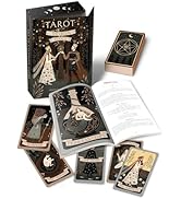
Golden Art Nouveau Tarot [Massaglia, Giulia Francesca] on desertcart.com. *FREE* shipping on qualifying offers. Golden Art Nouveau Tarot Review: Gently Embossed - The box: Box comes wrapped in plastic. No dented corners. Has the same beautiful gold foil as advertised for the cards. Embossed with delicate pattern overlaying the gold. Inside the box: Cards inside are also wrapped in plastic. Comes with an info card about their website which you can use to expand your knowledge on tarot through this specific deck but... at a price? Seems this membership/subscription costs money though since the card comes with a coupon code. Also included; a pamphlet in English, Italian, Spanish, French, and Portuguese; that describes what is happening on each card and a single sentence about how to interpret its meaning. (Kind of useless in my opinion.) All cards were present plus an extra card that is a reprint of the front of the box. The cards: The gold on the cards is just as advertised and as beautiful as the box. Embossed as well. Cards fit nicely in my giant hands. Bigger than a “regular” playing card size but smaller than my past tarot cards. Artwork is impeccable and beautifully printed on both the front and back. Both sides come lightly laminated. Cards are made with a lightweight card stock. Nice for easy shuffling although I think it could be a liiiiiiiiiittle bit heavier. There is a slight white boarder around them which helps minimize any bent corners taking away from their beauty. Final thoughts: I’m so happy. 10/10 Review: Beautiful deck! - Beautiful deck. Cards shuffle easily, and read well. The size is perfect for smaller hands, and I like that! I am a professional reader, and really enjoy the ease of these cards.


| Best Sellers Rank | #35,186 in Books ( See Top 100 in Books ) #52 in Tarot |
| Customer Reviews | 4.8 4.8 out of 5 stars (5,038) |
| Dimensions | 2.75 x 1.13 x 4.81 inches |
| ISBN-10 | 0738763462 |
| ISBN-13 | 978-0738763460 |
| Item Weight | 2.31 pounds |
| Language | English |
| Publication date | November 8, 2019 |
| Publisher | Llewellyn Publications |
A**X
Gently Embossed
The box: Box comes wrapped in plastic. No dented corners. Has the same beautiful gold foil as advertised for the cards. Embossed with delicate pattern overlaying the gold. Inside the box: Cards inside are also wrapped in plastic. Comes with an info card about their website which you can use to expand your knowledge on tarot through this specific deck but... at a price? Seems this membership/subscription costs money though since the card comes with a coupon code. Also included; a pamphlet in English, Italian, Spanish, French, and Portuguese; that describes what is happening on each card and a single sentence about how to interpret its meaning. (Kind of useless in my opinion.) All cards were present plus an extra card that is a reprint of the front of the box. The cards: The gold on the cards is just as advertised and as beautiful as the box. Embossed as well. Cards fit nicely in my giant hands. Bigger than a “regular” playing card size but smaller than my past tarot cards. Artwork is impeccable and beautifully printed on both the front and back. Both sides come lightly laminated. Cards are made with a lightweight card stock. Nice for easy shuffling although I think it could be a liiiiiiiiiittle bit heavier. There is a slight white boarder around them which helps minimize any bent corners taking away from their beauty. Final thoughts: I’m so happy. 10/10
F**S
Beautiful deck!
Beautiful deck. Cards shuffle easily, and read well. The size is perfect for smaller hands, and I like that! I am a professional reader, and really enjoy the ease of these cards.
A**R
A Beautiful Deck
This product arrived promptly and as expected with out issues. Arrived in a bubble mailer and undamaged. I was originally worried about the quality of the foil but the prints look fantastic against it and it doesn't seem cheap in the context of the artwork. It compliments the illustrations nicely and is not overly reflective while still maintaining that metallic finish. The images themselves are clean and crisp and hold the colors vibrantly. The card stock isn't as thick as some tarot cards, but it's nice and smooth as opposed to the textured look that playing cards can have. I think it'd have benefited from being a touch thicker, but is perfectly serviceable as is. Really the only thing that I have any issue with. The book it provides is in English, Italian, Spanish, French, and Portuguese. The descriptions of the cards are exactly that; more common descriptors of generalized events of the cards than direct translations of meaning, so a novice like myself will need a few supplemental sources to help learn meanings and intricacies. The box is guided in the same foil as the cards and is about the same quality as a regular deck of cards' box. The illustrations on it are of the same quality of the cards themselves and the text is thoughtfully placed to reduce visual noise and works well as a design and not just a hastily constructed sales pitch.
C**S
An all-time favorite for me
I really, really love this deck. I'm a big fan of the traditional Rider Waite deck, and this is very close to that one, but the art absolutely pops out at you and just seems alive in a way. Some cards feel like you could reach into them, almost. The whole thing is very beautifully done. My only real complaint is they don't shuffle too well if it's been humid at all. And I sometimes have to take the time to wipe them all down after many uses because otherwise they stick while shuffling. A small price to pay though. This was my third deck, I now have over 15 and this is my most used one. If you like the RW, this is a great addition to your collection because the art is so similar but can be more impactful, IMO. For me, the symbolism of the cards, beyond their basic understood meaning tend to stand out more.
O**Y
Beautifully inspiring
Beautiful tarot cards very inspiring. Saw them on a YouTube video and fell in love immediately. So happy that I got them
M**.
Gorgeous artwork!
The artwork of this Tarot deck is exquisite and for those of us who grew up using the old Rider-Waite deck, you don’t have to get used to relearning the symbolism of each card. I picked right up reading the cards with no trouble at all! I love other artist’s interpretations of Tarot and I have several other designs that only loosely resemble the symbolism of Rider-Waite, but this deck looks beautiful and has the added benefit of being consistent with what I’m used to. A real treat to own! It’s my favorite “everyday” deck by far! Also, I should mention that the cards themselves are a perfect size for my hands. They’re not overly sized to where you can’t easily shuffle and they aren’t too small to be the size of regular playing cards. I do own an original art Rider-Waite deck of playing cards size which was my go-to deck, but now my go-to is this beautiful deck of art that doesn’t require my intuition to re-invent the symbology I’ve been familiar with since I first picked up Tarot in my teens. I highly recommend this deck. You won’t regret it!
D**7
Gorgeous
I love the deck, it's gorgeous. Gold embossing, lovely artwork. So pretty to look at and read with. The card stock is nice and smooth, very soft to touch and somewhat matte finished. My only wish was that it was a bit thicker. But thats a me preference and not a deal breaker. I have the tarot mucha deck too, which is one of my faves. This one reminds me of that deck (tho obvs different) Cant go wrong with Lo Scarabeo.
D**Y
A Very Special Deck -- Beautiful and Accessible
I have only had this deck a couple of days and have yet to do more than my two-card daily draw with it, but I can’t wait any longer to sing some praises. First off, Giulia Massaglia is an artist of incredible abilities combined with sensitivity for her subject. As it has shaken out for me through the decades of my involvement with the Tarot, I focus my actual workings with mostly RWS decks, or close derivatives. I tell you I am just nearly beyond words at what she’s pulled together here! All the tradition, the details, they’re all here but seen re-created with an entirely new view. This woman did an amazing thing, and I feel deep gratitude for her work. Then, I started to read the little book that accompanies the deck and found it more interesting than most of those, but it wasn’t until I turned the booklet over that I discovered the text had been written by Lunaea Weatherstone, fellow devotee of Brigid, and creator of two wonderful decks herself, Mystical Cats and Forest of Enchantment that I have. I was delighted all over again! I think Giulia and Lunaea should collaborate on a more detailed book to accompany this deck. It deserves it. I took longer than many to find this deck but find myself totally enchanted and feel it will be in my top three decks now and going forward.
Trustpilot
3 weeks ago
2 months ago